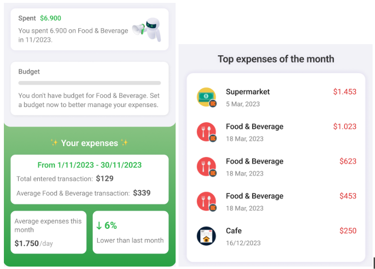
1.Data aggregation on the Home screen
Example data:
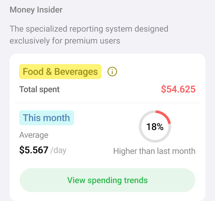
The selected expense category here is your most frequent spending category, and the total amount you have spent on that category. For example, Food & Beverages spent 54,625 USD.
Average 5,567 USD/day: The average amount you have spent on Food & Beverages per day up to the present.
Compare the amount spent on Food & Beverages for this month with the previous month.
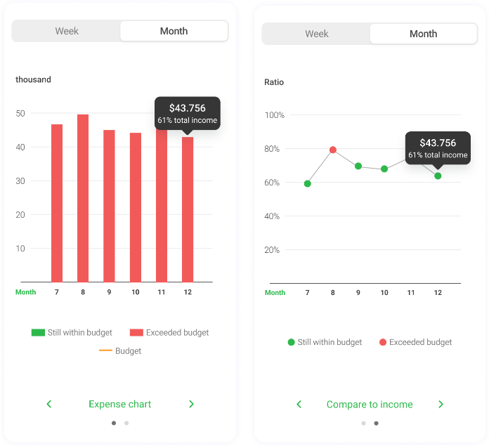
2.Money Insider main screen
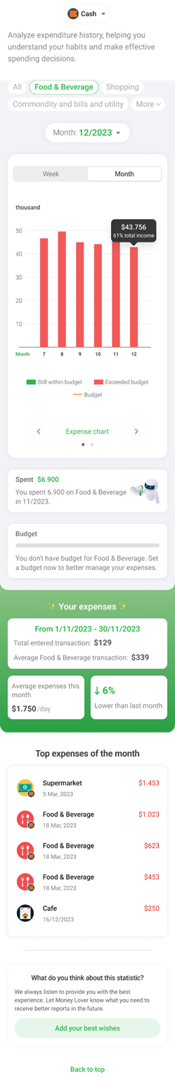
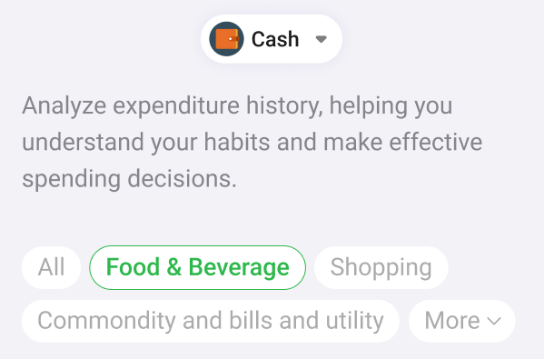
- Here, you can select Wallets and individual Expense Categories to track on the chart.
There are both Monthly and Weekly charts for everyone to choose from.For example, if you select December, the December chart will appear on the far right. The same goes for the weekly chart.
Charts compare expenses of the Category with Total Income, making it easy to manage your personal finances.
- Consolidates all information about the selected Expense Category as a personal assistant for you.